Customizable Loading Indicator for Silverlight 3

Introduction
I wrote the first version of the article a year ago. I needed a simple loading indicator for my Silverlight application, something like a spinning wheel. I found a few controls, but... some of them were too complex, some - pretty hard to customize. Finally, I created my own control and published an article on the CodeProject. The feedback received forced me to return to the code and make it better and simpler.
Here's the second try. Click on the link to see the working Loading Indicator demo on my web site.
What was changed in the second version:
- Repacked for Silverlight 4
- Removed some useless properties
- Simplified control template
- Optimized animation
Background
A few words about what I planned to create. First of all, it should be a simple, customizable control. The only limitation - I didn't want to hard code its geometry, a shape of animated element. This element is defined in the Generic.xaml file, but can be redefined as a part of a user's Style.
If you look at the Generic.xaml, you will see only one animation element AnimationElementTemplate defined as a DataTemplate. The problem was to manifold it. I was surprised to know that deep object cloning is a challenging task in Silverlight. If it takes three lines of code in WPF (here is a link to an example), there is no simple solution for Silverlight.
At first I borrowed a code, cloning objects, from a nice article Professional Drag and Drop Manager Control for Silverlight 2 by Thilo Ruppert. But later, I have followed Nicolas Dorier's advice to use DataTemplate as an animation element and just load it as many times as I need. Thank you Nicolas for your comments.
So, now we have an animation element and we know how to make its copies. Let's see how it works.
How It Works
Download my demo solution and open it in Visual Studio. Here is its structure:
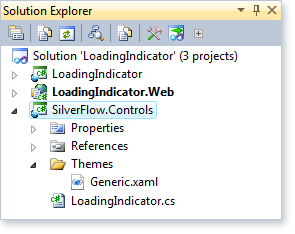
The SilverFlow.Controls project contains the following files:
| LoadingIndicator.cs | Defines properties and behavior of the control |
| Generic.xaml | Defines default template of the control |
First of all, let's look at the Generic.xaml first:
<Style TargetType="controls:LoadingIndicator">
    <Setter Property="Width" Value="42" />
    <Setter Property="Height" Value="42" />
    <Setter Property="Count" Value="12" />
    <Setter Property="Duration" Value="0:0:1" />
    <Setter Property="Template">
        <Setter.Value>
            <ControlTemplate TargetType="controls:LoadingIndicator">
                <Canvas x:Name="PART_AnimationElementContainer"
                    Background="{TemplateBinding Background}" />
            </ControlTemplate>
        </Setter.Value>
    </Setter>
    <Setter Property="AnimationElementTemplate">
        <Setter.Value>
            <DataTemplate>
                <Rectangle Fill="#00C0FF" Height="10"
			Width="6" RadiusY="2" RadiusX="3" />
            </DataTemplate>
        </Setter.Value>
    </Setter>
</Style>
It defines two most important parts of the control: PART_AnimationElementContainer and AnimationElementTemplate. PART_AnimationElementContainer is used as a container. Animated elements will be manifold Count times and placed into inscribed circle of the container. It performs the following code:
for (int i = 0; i < this.Count; i++)
{
    // Copy base element
    FrameworkElement element = (FrameworkElement)AnimationElementTemplate.LoadContent();
    element.Opacity = 0;

    TranslateTransform tt = new TranslateTransform() { X = x, Y = y };
    RotateTransform rt = new RotateTransform()
	{ Angle = i * angle + 180, CenterX = (width / 2), CenterY = -innerRadius };
    TransformGroup tg = new TransformGroup();
    tg.Children.Add(rt);
    tg.Children.Add(tt);
    element.RenderTransform = tg;

    animationElementContainer.Children.Add(element);

    DoubleAnimation animation = new DoubleAnimation()
    {
        From = animationElement.Opacity,
        To = EndOpacity,
        Duration = this.Duration,
        RepeatBehavior = RepeatBehavior.Forever,
        BeginTime = TimeSpan.FromMilliseconds
			((this.Duration.TotalMilliseconds / this.Count) * i)
    };

    Storyboard.SetTargetProperty(animation, new PropertyPath("Opacity"));
    Storyboard.SetTarget(animation, element);

    Storyboard sb = new Storyboard();
    sb.Children.Add(animation);
    sb.Begin();

    storyboardList.Add(sb);
}
A Small Trick
Thanks to Aaginor - he pointed to a small problem. If you change visibility of the indicator to Collapsed, animation still runs, consuming resources. The first idea was to catch something like OnVisibilityChanged event, but you could hardly find such an event. Well, there is a LayoutUpdated event. And it definitely occurs when a control changes its visibility. But not only in this case.
That's why I decided to use a small trick - to create a private ControlVisibility property and bind it to the Visibility property of the control:
Binding binding = new Binding()
{
    Source = this,
    Path = new PropertyPath("Visibility")
};

this.SetBinding(LoadingIndicator.ControlVisibilityProperty, binding);
That gave me a possibility to intercept changes of the visibility in the OnControlVisibilityPropertyChanged method. Nice place to stop animation when the indicator becomes invisible.
When you run the demo, you will see a "Show/Hide Indicators" button. It toggles visibility of the indicators. I added it to check whether my code can really handle non existing OnVisibilityChanged event. It can!
Using the Code
Loading Indicator control has two public properties:
Count |
Number of animated elements. 12 by default. |
Duration |
One animation cycle duration. One second by default. |
Look at the Styles.xaml, containing three templates for the loading indicators, shown in the demo. The first control uses built-in style, defined in the Generic.xaml. Three other controls use their own styles.
History
- 24th November, 2009: Initial post
- 8th December, 2009: Added "A Small Trick" section
- 28th November, 2010: Simplified control template
 "
" crorkz matz[37.233.27.*]2014/8/5 16:03:03#6